ProovStation: A new brand identity combining innovation and visual consistency
BRANDING
STRATEGY
FRANCE & USA
WEBSITE
EVENTS

ProovStation places both innovation and precision at the core of its DNA. As Europe’s leading provider of AI-based vehicle inspection solutions, the company stands out for its commitment to transforming the automotive industry. In developing their new visual identity, it was crucial to reflect this unique synergy between cutting-edge technology and forward-looking vision.
OBJECTIVES
Unite innovation and precision while ensuring visual coherence across all communication channels.


ProovStation’s visual identity is anchored in the slogan, Intelligent solutions, positive mobility, which encapsulates both its commitment to innovation and its focus on sustainability. The TireStation and CarStation logos align with the ProovStation design system, reinforcing a cohesive visual language and strengthening the overall brand architecture.

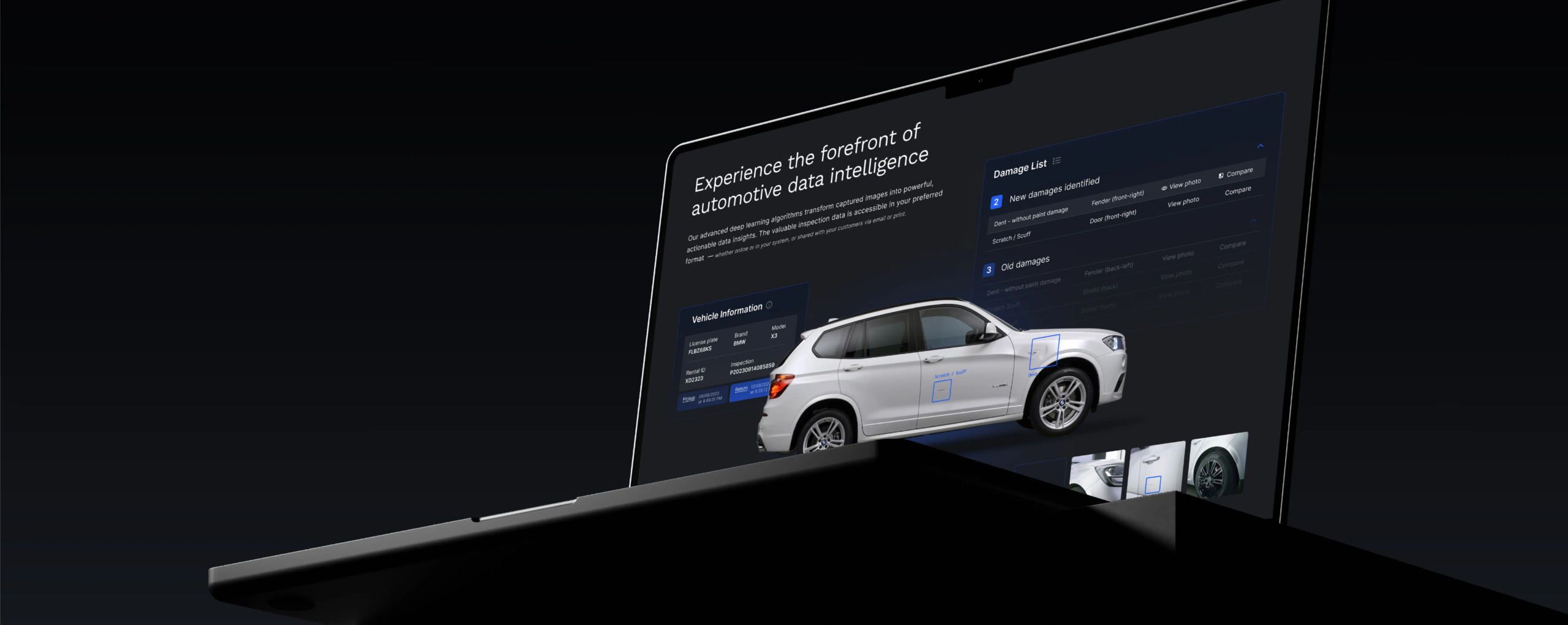
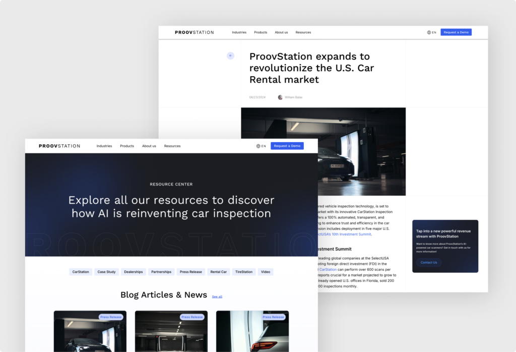
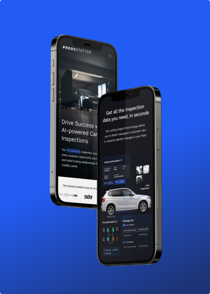
The website’s design was conceived to embody innovation through refined, minimalist aesthetics. The visual presentation of solutions has been carefully optimized to both engage and inform the users, while ensuring seamless intuitive navigation.

On social media, strategic content was developed to showcase the strengths of the TireStation and CarStation solutions, emphasizing their impact within the automotive industry. ProovStation’s strategic partnerships were also brought to the forefront, enhancing brand visibility and reinforcing its position within the intelligent mobility ecosystem.
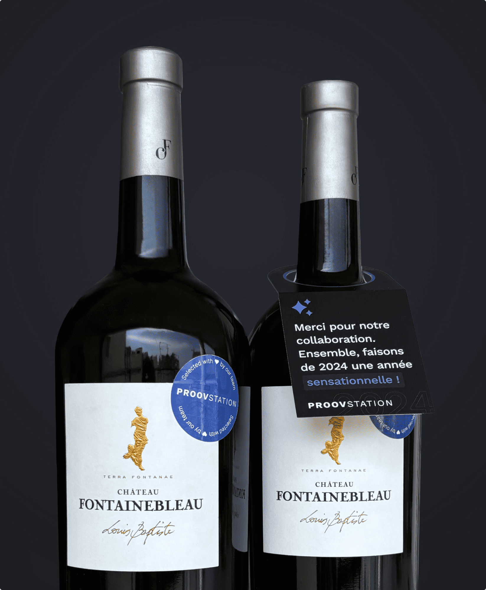
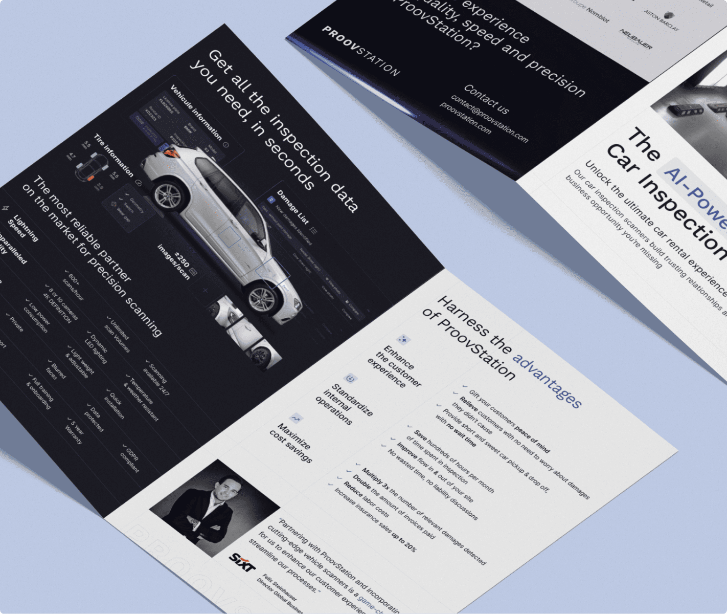
ProovStation takes part in major trade fairs around the world, requiring high-impact, tailor-made visuals. The graphic elements created for these events, whether brochures, leaflets or videos, ensure a strong visual coherence.
They contribute to strengthening ProovStation’s reputation, while showcasing their technological solutions in a competitive international context.


Continue exploring
Adrien Cornelissen
A visual and digital strategy highlighting its commitment to social innovation and digital creation.

Gojob
Creation of a clear, coherent and resolutely contemporary visual identity that speaks to all markets.